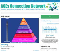
 Although we always hope that we're responsive to our members, "responsive" in this case means that ACEsConnection will work and look the same on cell phones, tablets, laptops and desktop computers. Social Strata, the company that provides our platform (called Hoop.la), has been working for months on this big change.
You'll see it in action in three to seven weeks. We'll give you more specific details when we know them.
The best thing about this new responsive ACEsConnection is that it looks less cluttered. Instead of three columns, the main page has just two. There's one main column, where the blog posts go, and one side column. The side column has the "Join ACEsConnection" box, the "About section", the activity feed, latest comments, etc. It looks a lot cleaner. When you first start working with it, it might seem almost too simple. But Val Krist, our graphic designer, and I spent a couple of hours playing around on the beta version, and when we went back to the current version, both of us said: "Ewww. This looks messy!"
The second-best thing about the new responsive ACEsConnection is that it functions the same way as the "unresponsive" one you're using now. With one exception -- it's MUCH easier to insert a main photo into a blog post. We'll explain how that works when we know the switchover date. And we'll include the info in the how-tos.
The third-best thing is that the groups will be able to use their own logo instead of the big gray box that says "ACEsConnection". (If you haven't joined a group, check out the Groups section to see what I mean, and, while you're there, see if any appeal to you.)
The fourth-best thing is that you won't have to do a thing for this transition. One day you'll wake up, and ACEsConnection will be clean, beautiful and.....responsive!


Comments (5)