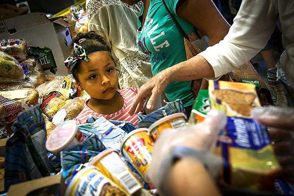
When Michael Hollister was tasked with creating a hunger heat map for the Capital Area Food Bank in Washington, D.C., the initial hot spots were right where everyone expected—the District’s poor 7th and 8th wards. But when the map, which showed areas of need, was overlaid with a second map based on pounds of food delivered by the Food Bank and its 500 partners, colors rearranged and a new landscape took form. Virginia’s Fairfax County, frequently ranked near the top on lists of America’s wealthiest counties, changed color—there were hungry people there too.
“People assume there’s not a lot of poverty and not a lot of need there,” Hollister said. “But what we found when making these maps are pockets of poverty sprinkled throughout the entire Fairfax area.” Parts of Reston in particular—named No. 7 onCNN Money’s “Best Places to Live” list in 2012—became a hot spot.
[For more of this story, written by Sarah McColl, go to https://www.takepart.com/artic...9/10/hunger-heat-map]


Comments (0)