One of the best visualizations of race in America might be called pointillist. By mapping one dot for every Census-registered human in the country, color-coded for race, a team at the University of Virginia’s Weldon Cooper Center of Public Service rendered abstract social data painfully personal.
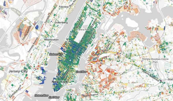
Robert Manduca, a Harvard PhD student in sociology and a mapmaker, has brought the power of the dot to a new dataset: Jobs. Using 2010 LEHD Census data, and much of the code that brought the racial dot map to life, Manduca created an interactive map of one dot for every job location in America.
Red dots represent manufacturing and trade. Blue dots are professional services. Green represents healthcare, education, and government. Yellow is retail, hospitality, and other services.
[For more of this story, written by Laura Bliss, go to http://www.citylab.com/work/20...ob-in-the-us/398480/]


Comments (1)