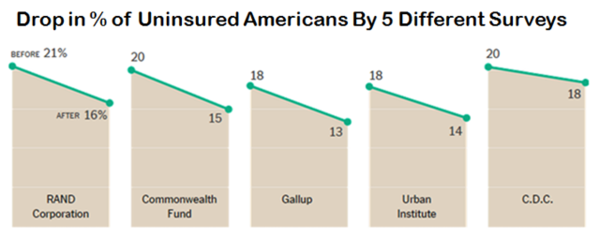
As a follow up to last week’s Top Ten Healthcare Quotes For 2014, this week we target some of the bigger healthcare stories through the lens of ten charts (and one PowerPoint slide) that appeared throughout the year.
Since 2014 was the first full year of expanded health insurance coverage under Obamacare, all spreadsheets were keenly focused on the number of people who signed up (and then paid) for individual coverage through the state or federal insurance exchanges. Those who were pulled into Medicaid’s expanded coverage were also referenced as a major success of the sweeping reform. The dual nature of this sizable cohort also makes it a great place to start with our first chart – itself a great candidate as our top pick for 2014.
[For more of this story, written by Dan Munro, go to http://www.forbes.com/sites/da...are-charts-for-2014/]


Comments (0)